Project Plan Documentation
In the beginning, Neil and I discussed some potential topics around health and technology.
Neil and I decided to do a presentation on smartwatches. There will be a PowerPoint presentation, and an infographic. We decided that we would research 4 smartwatches each for comparison. Afterwards, we started working on the presentation and infographic. We aimed to have a 15-20 page presentation to introduce different brands of smartwatches, and a brief but eye-catching brochure that captured the benefits and extensive features of these devices.
Learning Objectives
By the end of the presentation, learners should know :
- The definition of a smartwatch
- That Apple, Samsung, Garmin, and Fitbit make & sell smartwatches
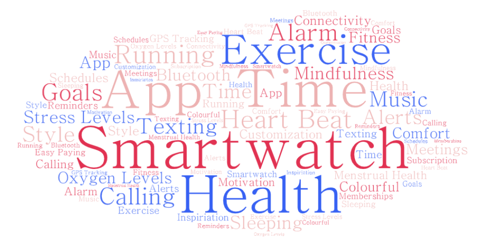
- Variety of features on smart watches such as activity tracking, health tracking, GPS location tracking, ECG monitors, Blood oxygen monitors, touchscreen displays, third party app support, and battery life.
- How to perform research on how to purchase a smartwatches that suits their health or other personal needs

Multimedia Principles
When creating our PowerPoint, we wanted to present smartwatches in a way that aligned with some of the learning theories covered in this course. Some theories we considered were the Cognitive Load Theory, Signaling Theory, and Dual Coding Theory.
Cognitive Load Theory posits that the human mind is only able to process so many ideas and items at a time (Mayer, 2011). Therefore our PowerPoint should retain the minimal number of text and objects to ensure viewers are not overwhelmed or confused by the content. For example, having only a single idea or one smartwatch per slide. Another related multimedia learning principle is the coherence principle. Initially the content on the majority of slides included additional text, which was extraneous, so we limited and cut down until we had more concise points.
Signaling Theory understands the use of highlighting techniques to place emphasis on the key parts and ideas of a slide (Mayer, 2014). Signaling techniques were used throughout the presentation, with key words such as the specific features a smartwatch may have or have not (Customization, Battery-Life, and Expensive). By highlighting certain words, viewers can better understand precisely the defining trait of each watch.
Dual coding theory understands that the way we humans process information can occur in different channels. Visual and verbal forms of information are simultaneously processed by separate parts of the human mind, therefore allowing for a mix of visual and verbal learning that allows learners to remember more as opposed to a single channel (Paivio, 2007). This is helpful for handling cognitive overload. Closely tied to dual coding theory is the multimedia principle – where we people learn better from the use of both text and imagery than either alone (Mayer, 2014). To facilitate these principles within our slides, we utilized images alongside text to depict the watches, brands, and research tasks.
Unlike with our PowerPoint, we wanted our brochure-style infographic to briefly describe what a smartwatch can do from a healthy-lifestyle perspective. We wanted to keep it eye-catching, simple, and easy to read. To improve legibility, we used primarily three colours of cyan, black, and white in the general design of the brochure. Overuse of colours can be distracting for a viewer as their perception may be overwhelmed (Easelly, 2018). The exception to this was the red text to highlight health on the cover page.
We followed similar multimedia principles in the design of the brochure as in the PowerPoint. Signaling theory was used in the aforementioned red text for “Health”, as well as in the ‘What is a Smartwatch’ page in the form of greater font and bolding to put emphasis on some benefits of smartwatches. Again, dual coding theory and multimedia theory was used through the icons alongside the list of potential smartwatch features.
In creating the brochure one major change we made was to cut down the length of the infographic. Initially the content was split apart with a few other pieces of information, but the additional pages had significant and redundant white space. Although the more condensed product may violate some multimedia principles (e.g. Cognitive Load in terms of items within a page), we felt that as the infographic wasn’t presented but rather read by the viewer in their own time, reducing whitespace and having a more compact design would be more practical and realistic. Furthermore the intent of listing smartwatch features isn’t necessarily to highlight just one or two, but the multi-functionality of the devices. The major selling point of smartwatches are their extensive number of functions.
References:
Easelly. (2018, September 23). What Makes an Effective Infographic?https://www.youtube.com/watch?v=rl9ZcfKt8sY
Mayer, R. E., & Fiorella, L. (2014). Principles for reducing extraneous processing in multimedia learning: Coherence, signaling, redundancy, spatial contiguity, and temporal contiguity principles. (pp. 279-315). Cambridge University Press. https://doi.org/10.1017/CBO9781139547369.015
Mayer, R. E. (2011). Cognitive Theory of Multimedia Learning. Cognitive Theory of Multimedia Learning – ETEC 510. http://etec.ctlt.ubc.ca/510wiki/Cognitive_Theory_of_Multimedia_Learning.
Paivio, A. (2007). Mind and its evolution: A dual coding theoretical approach. L. Erlbaum Associates. https://books.google.ca/books?hl=en&lr=&id=FaGYAgAAQBAJ&oi=fnd&pg=PP1&ots=Fca4XsFZZv&sig=h4L9uKLg18arcOVTG7yxkU8qb-s&redir_esc=y#v=onepage&q&f=false
Leave a Reply
You must be logged in to post a comment.